16 Jun Finalizing the Layout
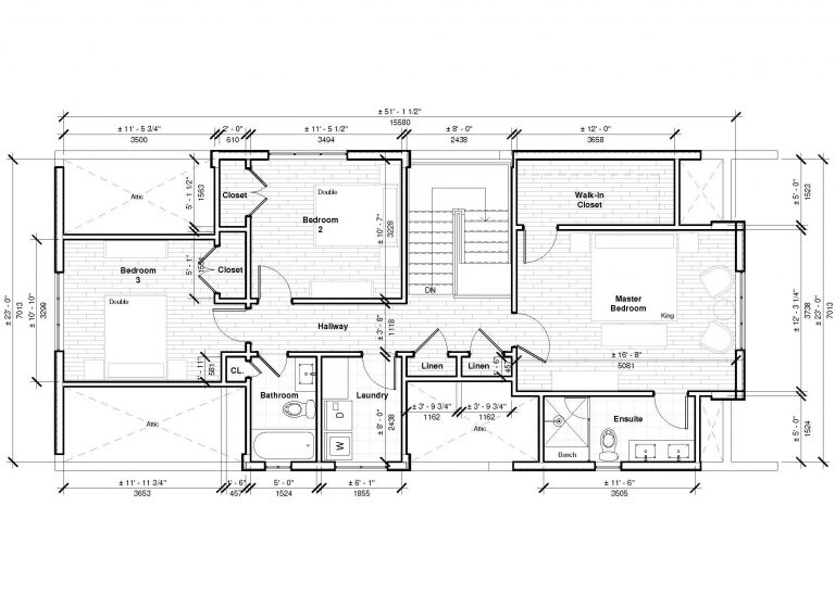
With the plan in place, the next thing to do would be to agree on a design and firm up the total project cost. Upstairs, we wanted 3 bedrooms, two bathrooms and a laundry room. On the main level, an office, an open concept living area and kitchen, and a deck off the back.
Our designer, Sarah, mocked up 3 options which would get us as much as possible while staying within the budget we had discussed at the outset, surely no easy task.
Being a narrow 22’ house, the open concept would be tough to deliver without a significant amount of extra work which the budget wouldn’t allow. She would work within the existing wall structure as much as possible to do so. Plumbing costs could be kept in check by keeping the new fixtures on the side where the plumbing stack exists today. The space upstairs would also have to be kept a bit tighter to keep materials and building costs in line – in many cases, adding sloped ceilings to the bedrooms.
All of this meant we would have to make a few small sacrifices to keep the costs anchored closely to the budget – this is easier to wrap your head around before you’ve seen the options.
Option 1
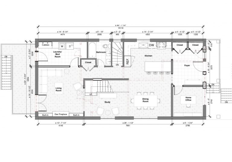
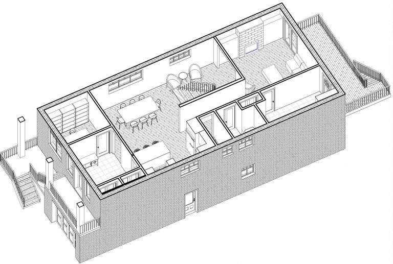
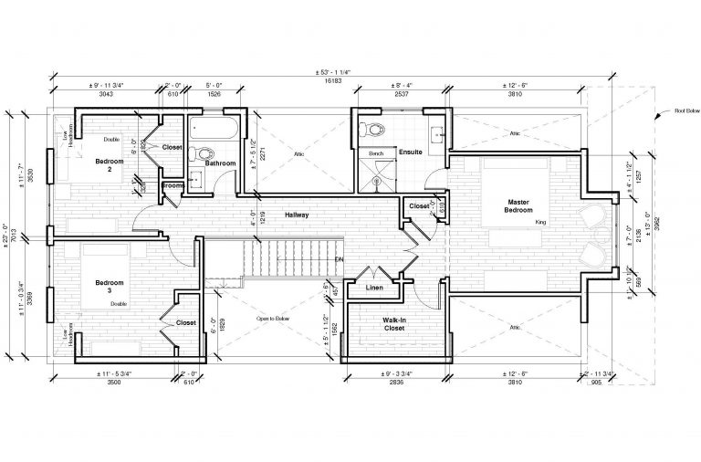
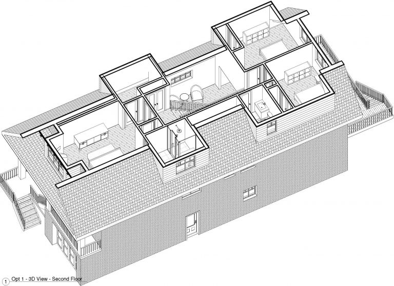
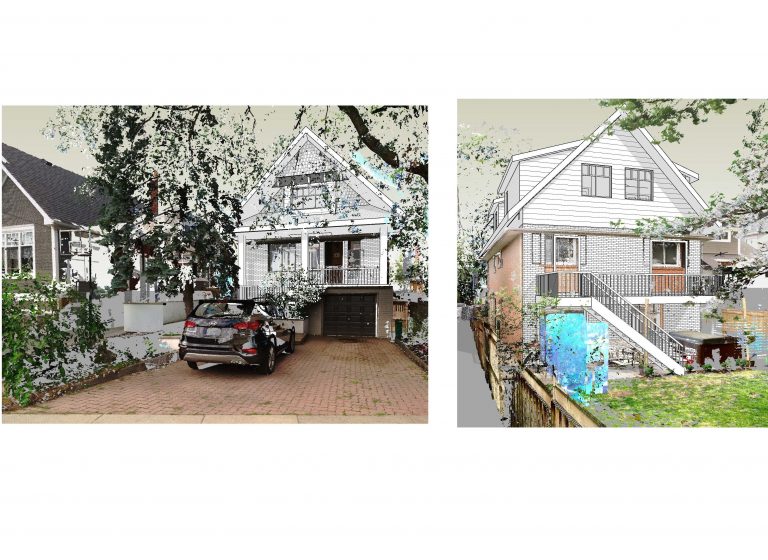
This layout kept the kitchen and dining largely as is, while opening up the wall between them and adding an island. The laundry room doubled as a mud room was a nice touch, and we liked that the study at the stairs would have a bit of a cathedral feel to it. The spacing between the bedrooms gave the exterior house some really nice variation.
Option 2
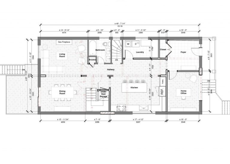
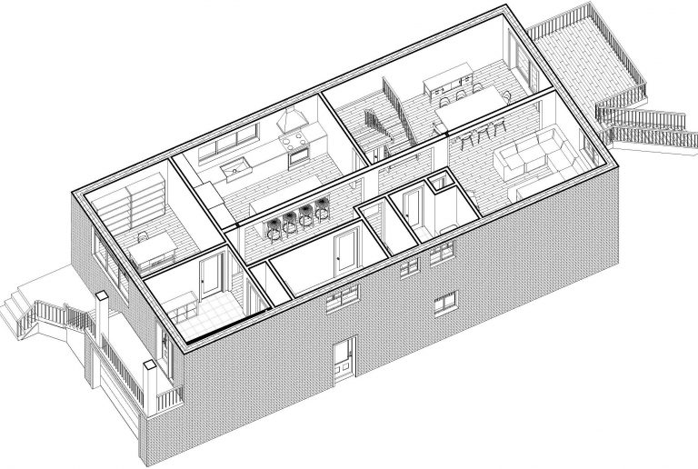
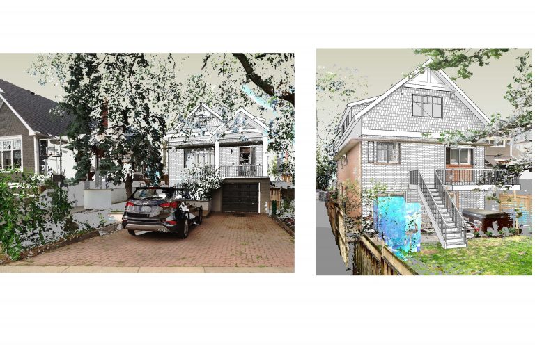
This design gave us a large kitchen, but it was cut off from the living and dining, which was an important element we were looking for. The space saved on the top floor actually gave us a cool option to use some really high ceilings over the office and foyer, and we loved the way the front of the house looked from the exterior.
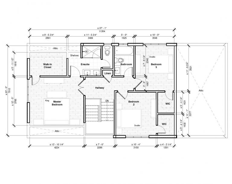
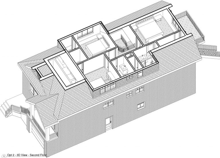
Option 3
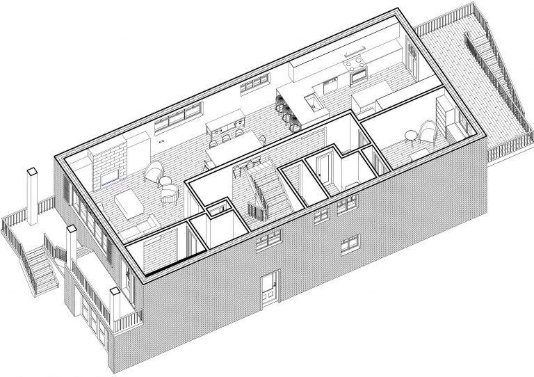
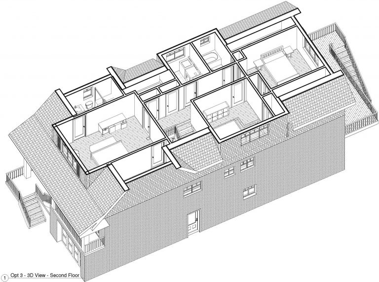
This layout connected the living, dining, and kitchen which was great, but it would all be along one side of the house. It would also get us the laundry room on the top floor, but we didn’t love the exterior view.
Final Design
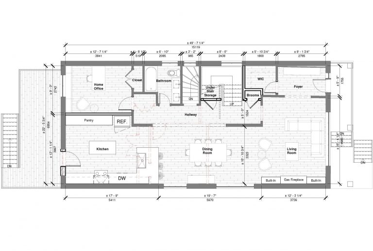
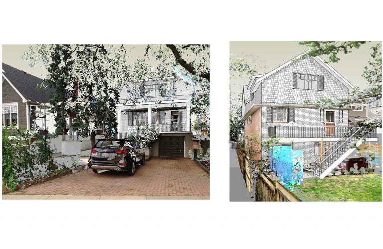
Ultimately, we liked elements from each of the layouts. After cherry-picking, some back and forth, and a few more renditions, we arrived at a design that gave us everything we were looking for and more.
The living, dining, and kitchen had more of that “great room” type feel. We added a tub to the ensuite in the main bedroom. Moved the laundry room upstairs. There was now tonnes of storage including a really nice pantry. Sarah gave us the idea of using the little space under the stairs as a little fort-style room for the kids. And ultimately, the curb appeal…appealed to us.
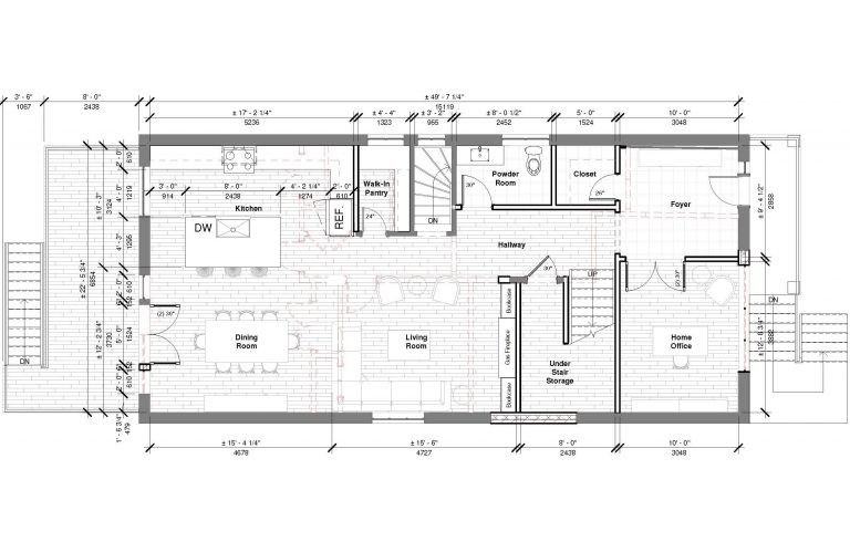
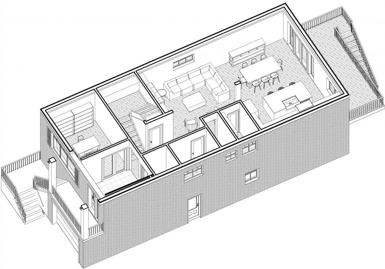
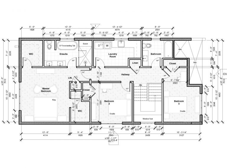
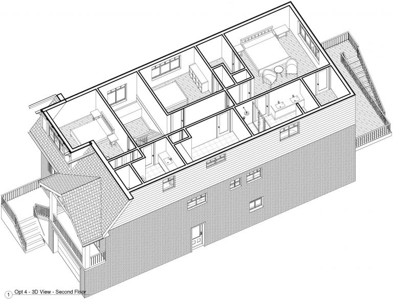
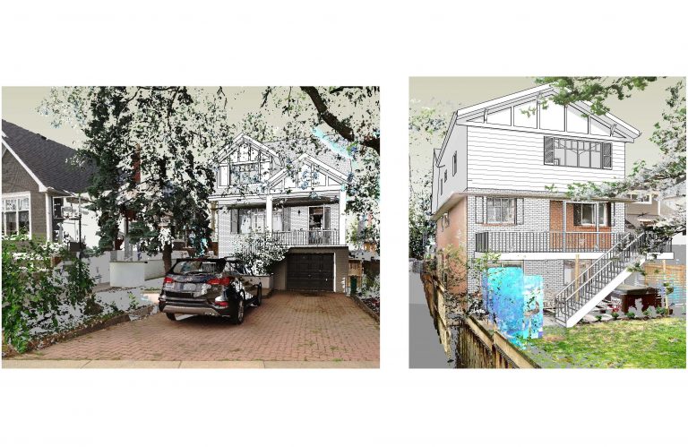
Getting everything in would clearly mean increasing the total cost of the project. As I said, the sacrifices are easier to deal with before having all options dangled in front of you. Once you see what it can be, it’s hard to walk away from. This is a trap you can easily save yourself from by reading any intro-level psych book or by having a moderate sense of self-discipline. We, however, had already allowed our hearts to be set on the all-you-can-eat option. Thankfully, we had planned ahead, knowing the costs would be higher than originally discussed and we had room in the budget to accommodate.
Final touches like windows, exterior trim, millwork, and hardware would come later. For now, we had a house that gave us everything we wanted and we were very excited.


No Comments